Mac & Cream
Project Background
Context
During my time at Boba Republic, I became acquainted and developed a good relationship with Mac & Cream through our collaborative pop-up events. Fast forward sometime later, I spoke with one of the owners and she mentioned how most customers created pre-orders through their phones. From there it led me to think,
“Is there a way I can elevate and streamline the ordering process for Mac & Cream? Could I provide value to the business by creating a more convenient ordering process for their customers?”
What is Mac & Cream? Why Create an App?
Mac & Cream is a small business B2C baking company founded in 2016 between two partners in DFW, Texas. They sell their products via pop-ups, deliveries, catering, and pre-order pickups. Seeing as most of their customers interact with them via mobile devices, they would like to create an app for more convenient and automated servicing.
Problem
Interacting With Mac & Cream is Too Time-Consuming and Confuses Users
The majority of the company’s orders are placed through the existing website or direct email/text communication via the users' mobile device which requires a great deal of input from both ends. On top of ordering, users find looking for products and other services on their website to be exceptionally confusing. Mac & Cream would like to create a more automated, convenient, and intuitive way for their users to interact with them.
Solution
Design a Mobile App that Streamlines Servicing
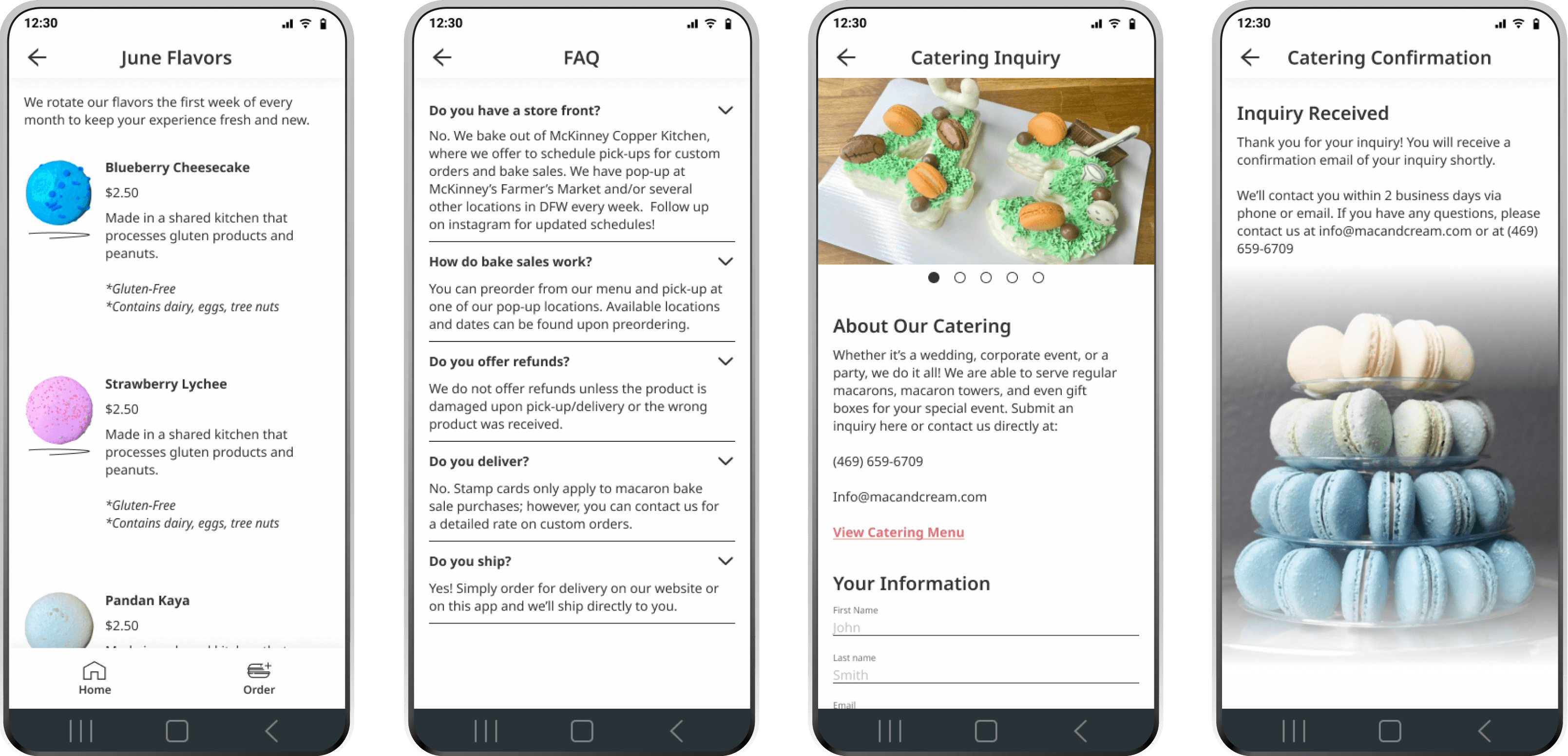
I created a mobile app design that's intuitive to navigate so that the user can easily find all of the services Mac & Cream offers. With fewer inputs, users can place orders, create catering inquiries, and be notified of upcoming news.
Project Kickoff: Laying Out the Foundation
Defining Business Goals
In our kickoff meeting, the business owner and I defined a successful app as one that:
🔑
Streamlines the order process without the back-and-forth, especially for businesses Advertises their catering and allows users to inquire about catering
🔑
Advertises their catering and allows users to inquire about catering
🔑
Makes apparent the rotating flavors that they have for a given month
🔑
Allows users to be notified of upcoming news and events
How Can We Help the Users? Understanding the User Experience
During that kickoff meeting, the business owner noted that the customers couldn't find what the monthly flavors were on the website. If they were having trouble with a simple task like that, what other problems were the users experiencing? To find out, I ran a usability test on Mac & Cream’s website to understand any problems the user was having when navigating it for specific use cases.
From those tests, I observed the following user problems:
💡
50% of users couldn't find the monthly flavors because there were no clear menu options
💡
100% of users couldn’t find catering details on their initial search because the catering page was not where they expected
💡
100% of users did not find the website intuitive to use because the navigation options were not what they expected
From these observations, I drew the following insights:
🤔
Because the navigation of the website was unclear, the app's navigation should model what a customer expects
🤔
In order to meet the business goals, the user flow for any use case must be simple to navigate
Defining the Macaron Lovers
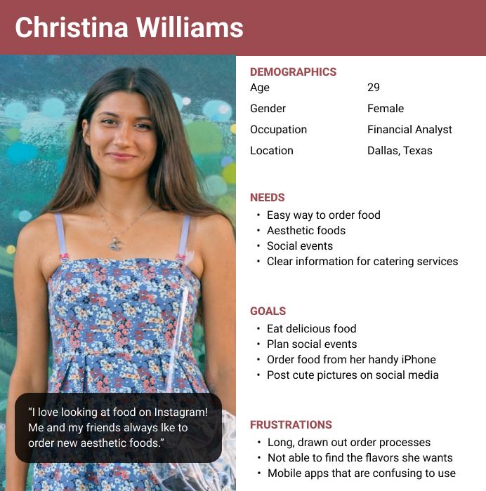
During that kickoff meeting, we also defined what their current userbase generally looked like. Please meet the personas, Christina Williams and James Douglass. Both of them dislike long & confusing order processes, place orders through their phones, and always want the newest items

Creating the Skeleton, Ideating for Intuition
Applying User Insights, Organizing the App for Intuitive Navigation
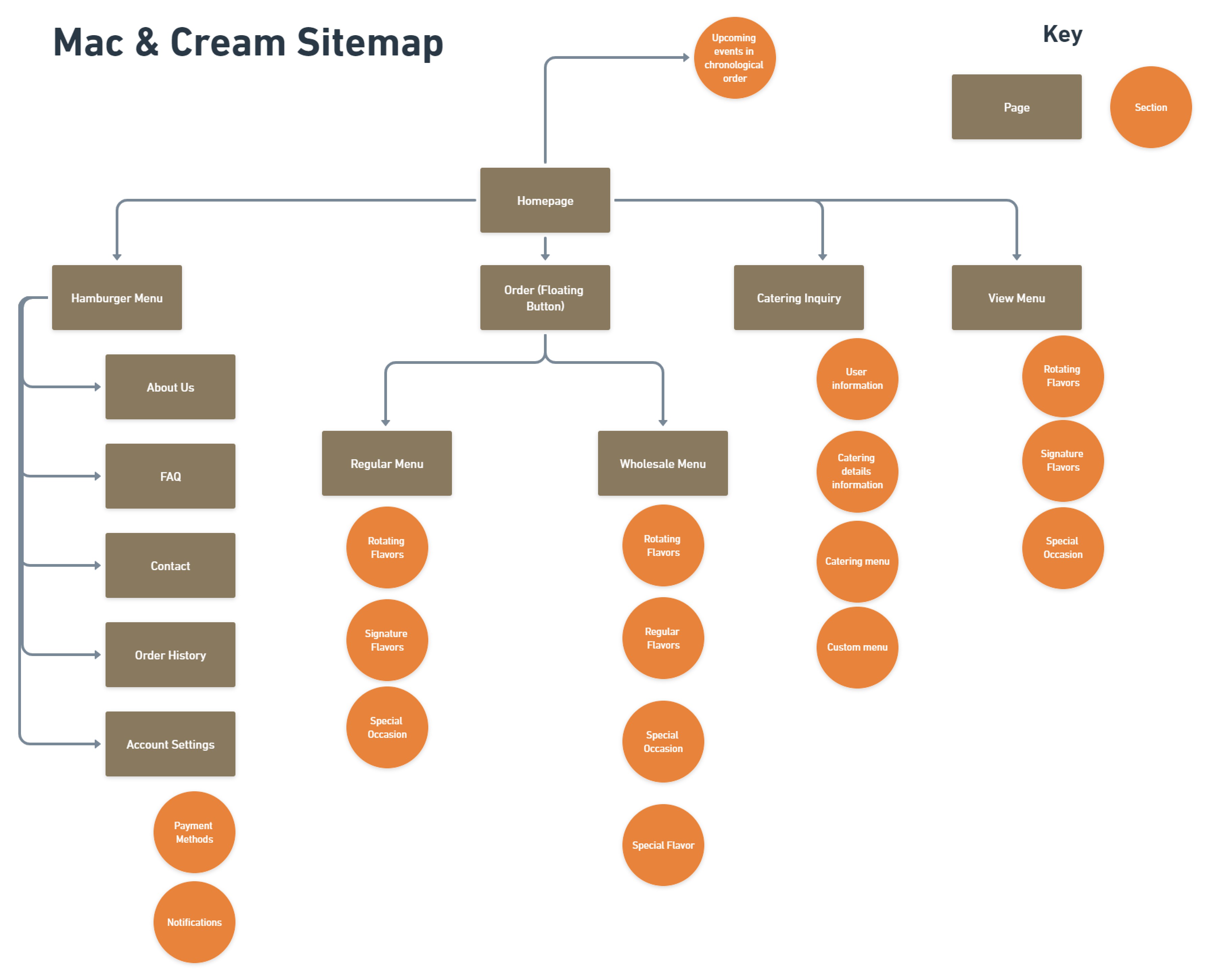
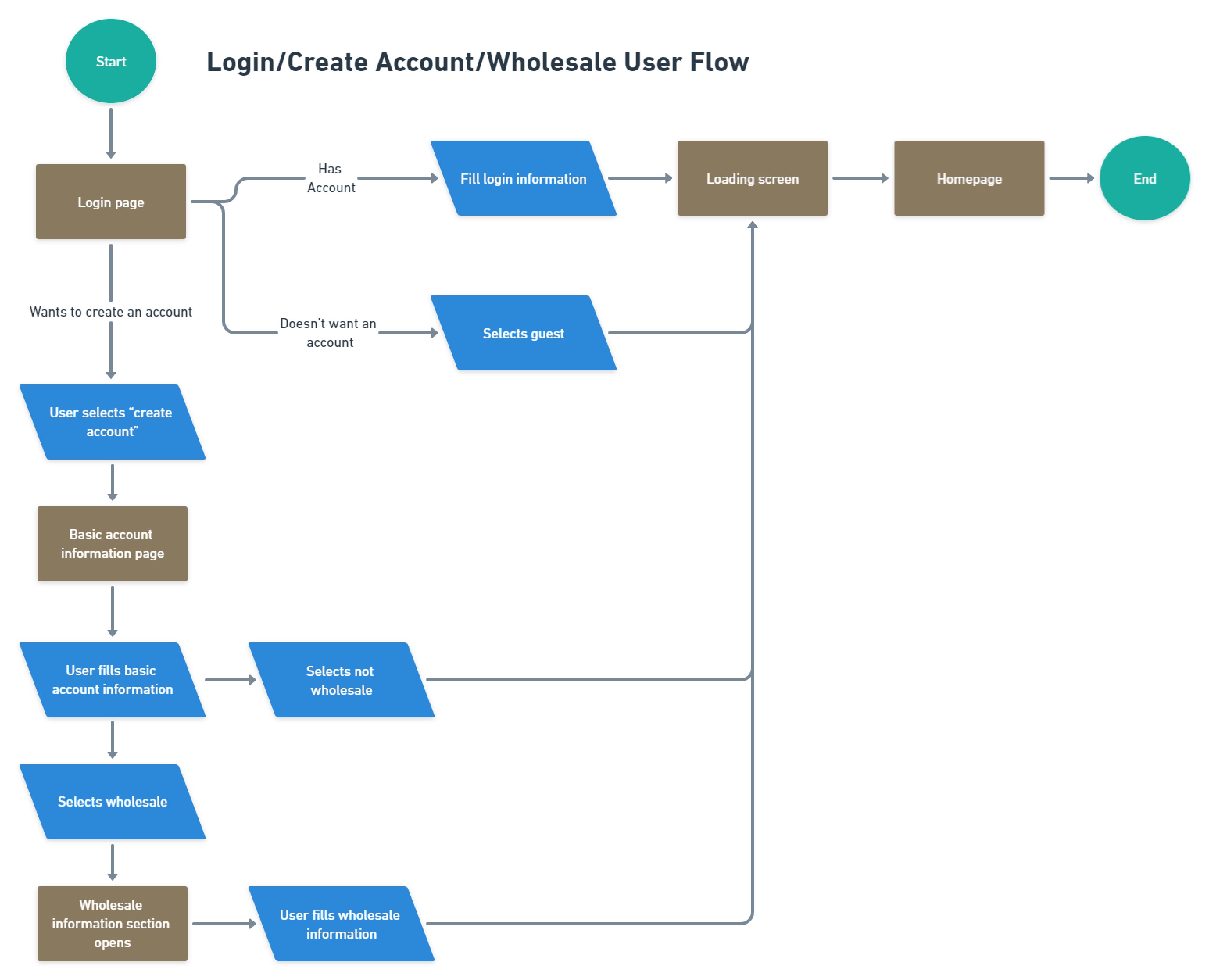
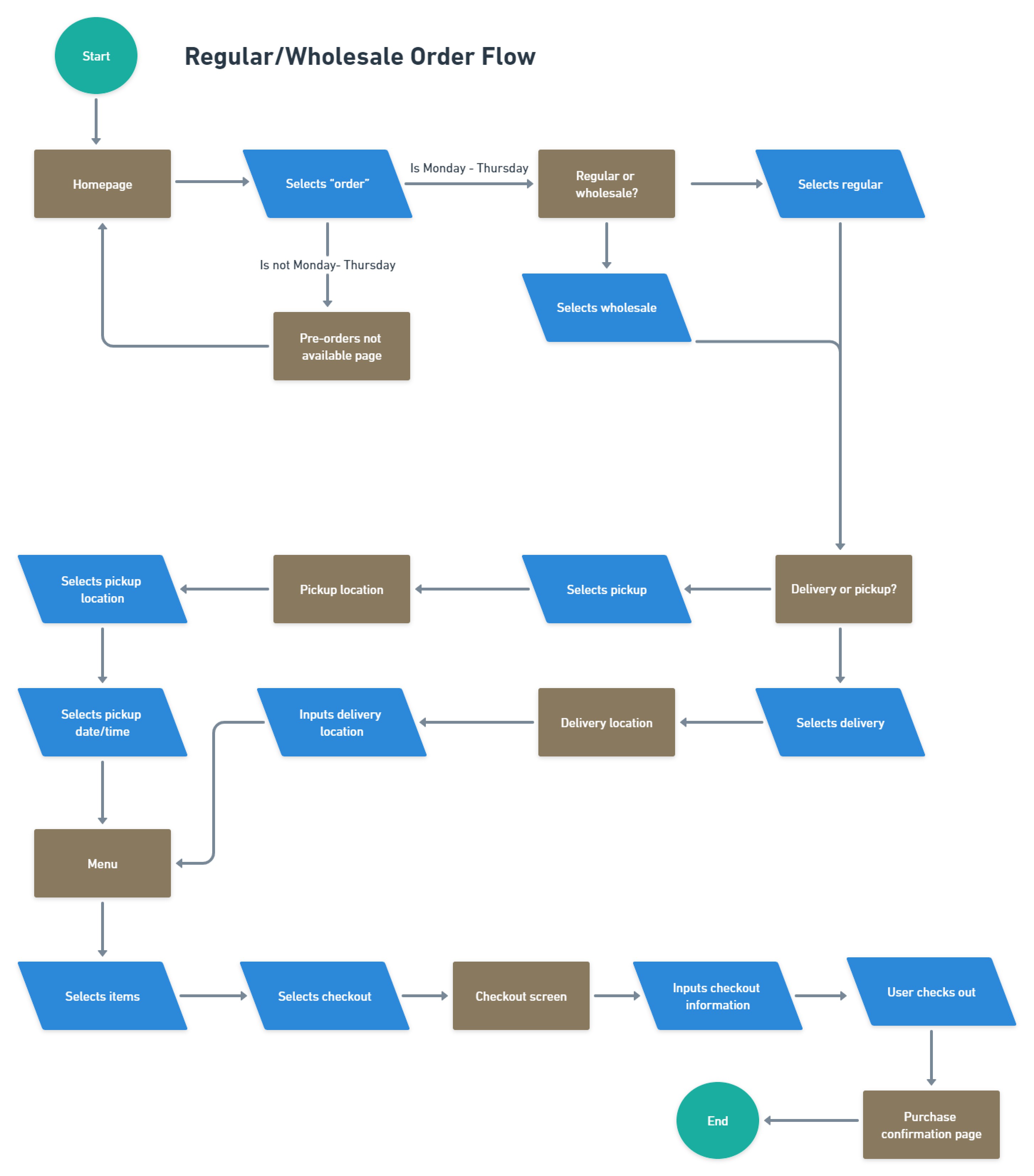
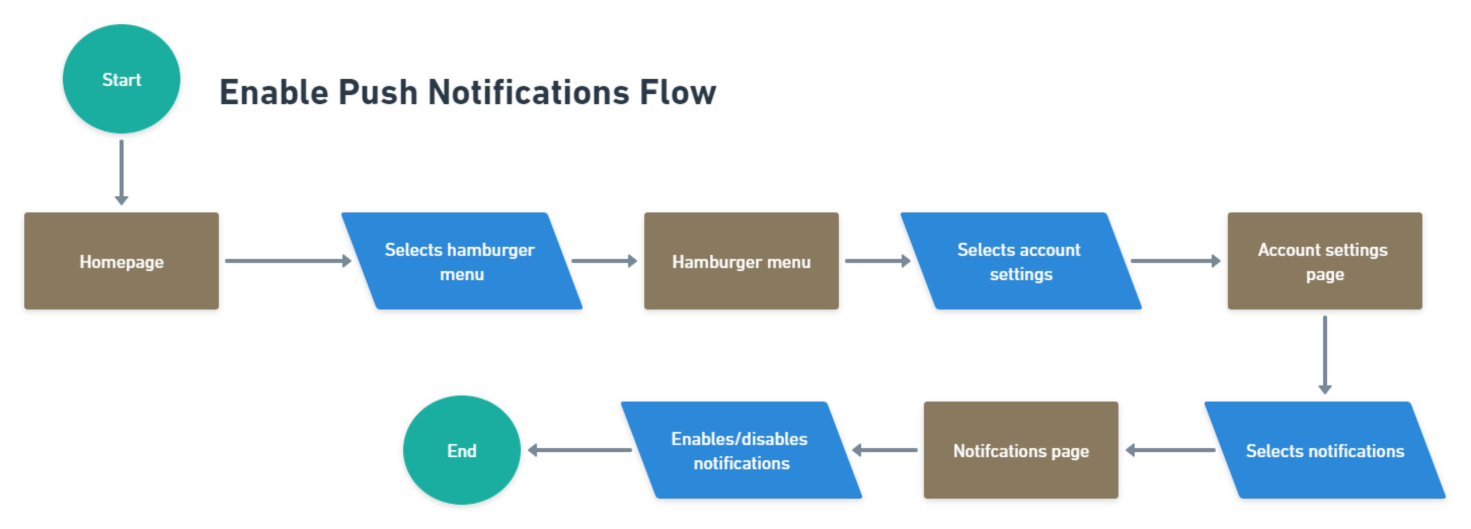
Referencing the navigational issues in the research, it was necessary to organize the product where the primary functions were easy to locate. I first created user flows to define each function. Then with these user flows, I created a sitemap to organize the design where Christina and James can quickly find the start of the order process, Mac & Cream's catering options, and other use cases. Per the navigational issues, I made sure that everything that James and Christina would want to do can be accessed through the home page.
Paper Solutions and Wireframes
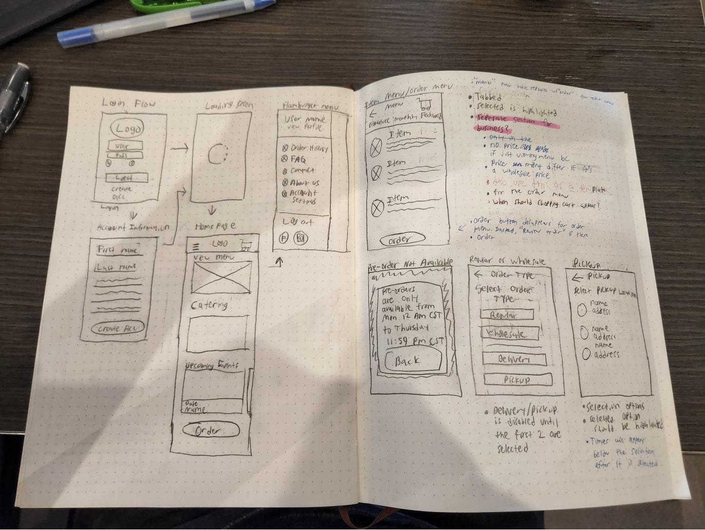
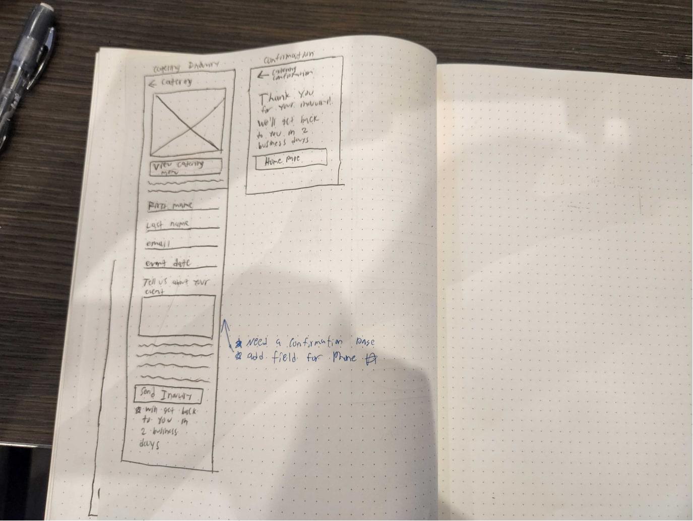
Then, I created sketches using the user flow and sitemap as a reference for the screens needing to be built. Following those sketches, I digitized them into mid-fidelity and then high-fidelity wireframes.

Testing & Refining the Product
Usability Test & Iterations 1 of 2
Now that I had the first iteration of the product, it was time to begin my first of two rounds of usability testing. While we wanted to address the issues of finding Mac & Cream's services, we observed several issues - some of which related were related to finding those products and services offered.
(For a full list of issues and recommended solutions, see here)
🤔
Issue 1
⅔ of users did not know how to find the monthly flavors from the home screen.
💡
Solution
I added a specific “Monthly Flavors” section on the home screen. Because this is a specific set of products that James and Christina would look for, it justifies having its own section on the home page.
Before

After

🤔
Issue 2
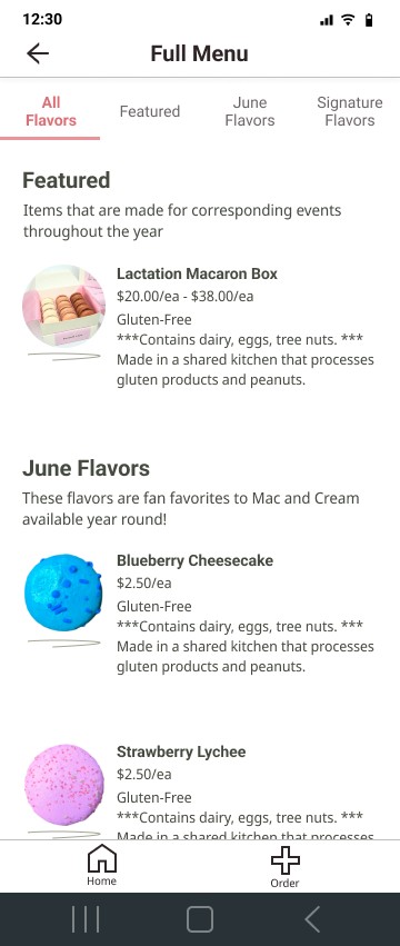
⅔ of users could not immediately find all the different types of products on the menu.
💡
Solution
I created a section in the menu that showcases all the flavors where users would, by default, land. This way, they’re able to see all the types of items without having to click the different categories.
Before

After
🤔
Issue 3
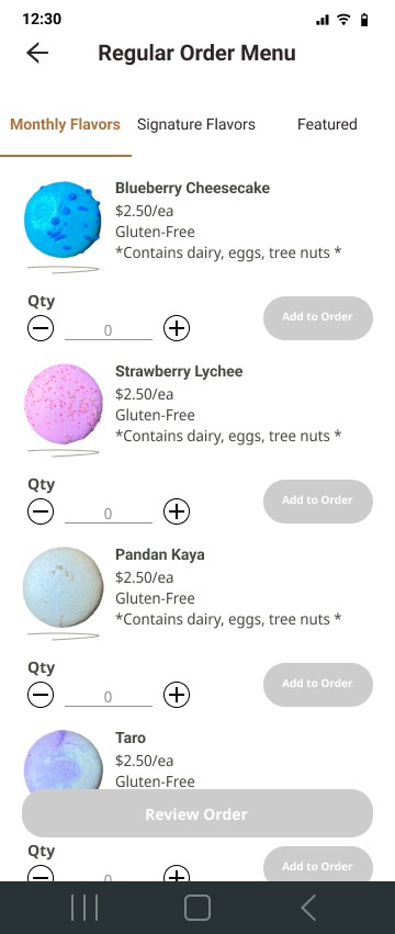
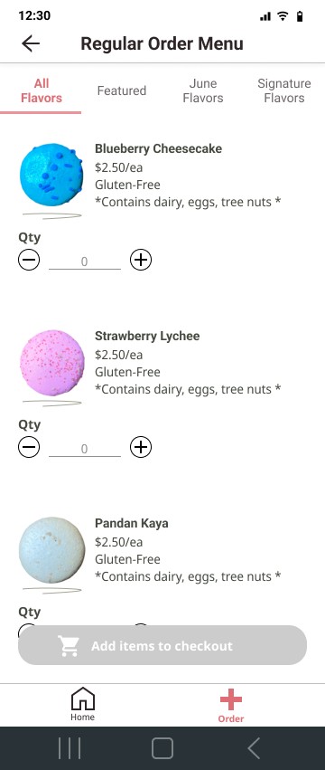
⅔ of users grouped the menu cards incorrectly, causing them to add the wrong items when adding an item quantity.
💡
Solution
I adjusted the spacing between each card so the grouping is more apparent, resulting in the “add” button being associated with the correct item.
Before
After
Usability Test & Iterations 2 of 2
With the new iterations, I conducted a second round of usability testing that resulted in more positive results. While most of the issues found were more UI and copy-oriented, there was one issue that could impact the number of inputs from the user.
(For a full list of issues and recommended solutions, see here)
🤔
Issue
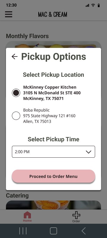
The pick-up time list took too much space. From a scalability standpoint, should there be many more pre-defined times, the user would have to make more inputs to find their desired pick-up time. Additionally, it would be more inconvenient to scroll back up to change the pick-up location with more pickup times.
💡
Solution
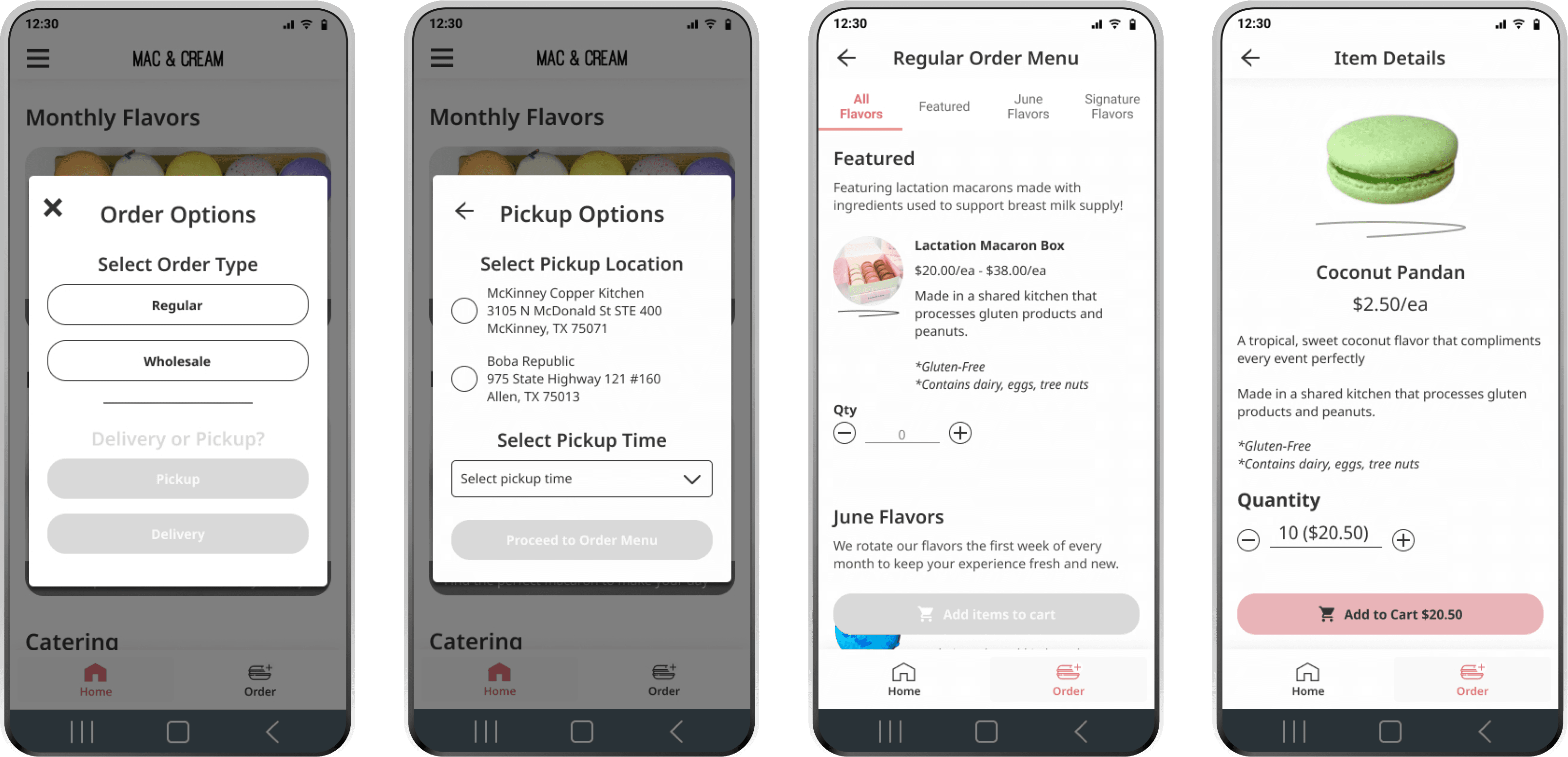
Changed the pick-up time from a list of radio buttons to a drop-down menu. This way, more times can be presented on the screen while reducing the amount of scrolling. Additionally, they can more easily go back to the location options should they choose to.
Before

After
Bringing it All Together
Intuitive, Simple, Friendly
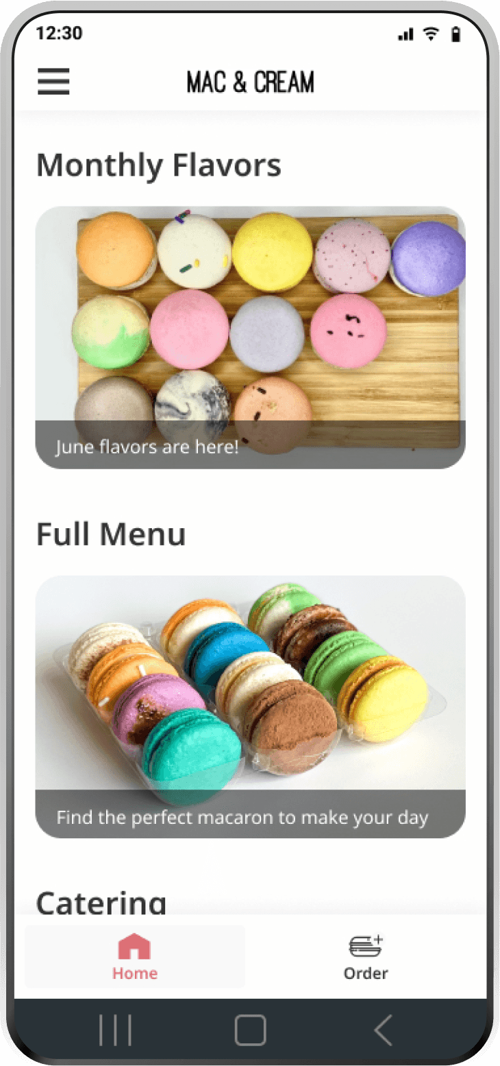
To address the navigation issues found in the research, all functions that James and Christina would use are easily found right on the home page.
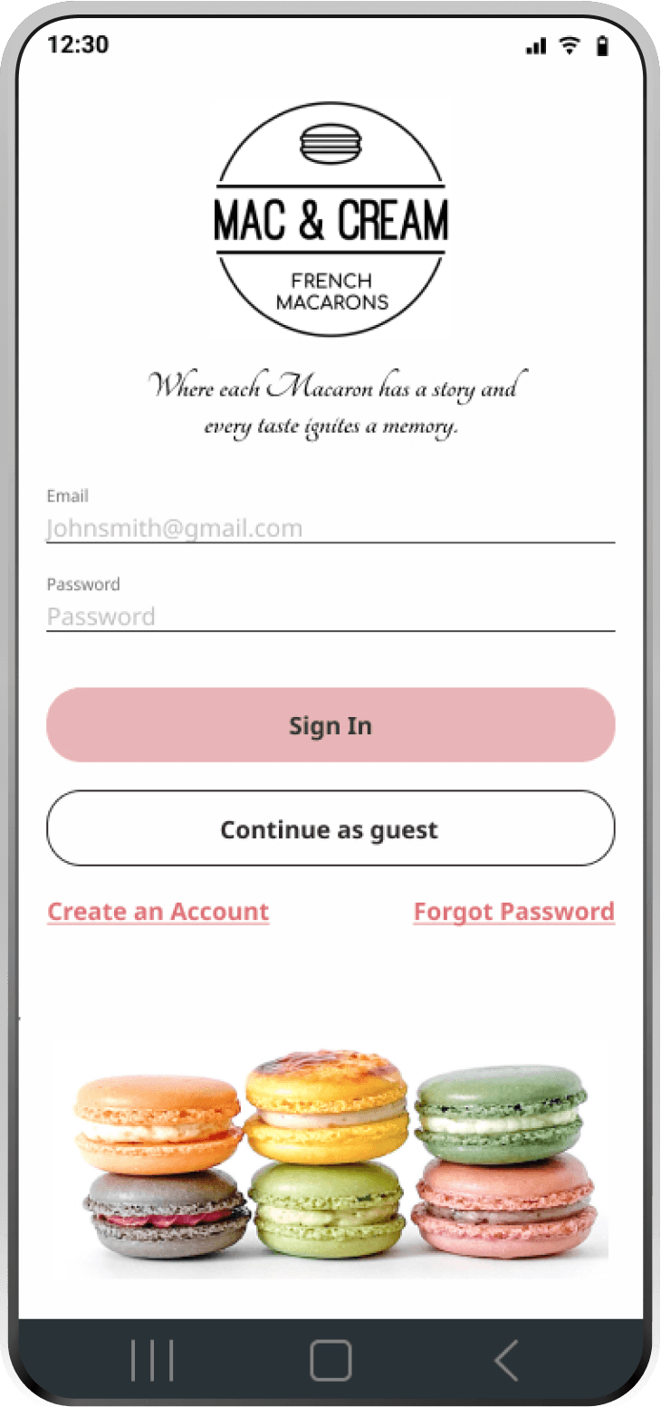
Because Mac & Cream's target demographic are young adults looking for the newest Instagrammable food, I stylized the design to have a simple pastel color palette that would bring attention to the colorful macarons.
Login Screen
Home Screen
Reducing User Inputs, Saving Time
Knowing that users like Christina and James dislike long order processes, it's important to have the user complete their intended goals as fast as possible.
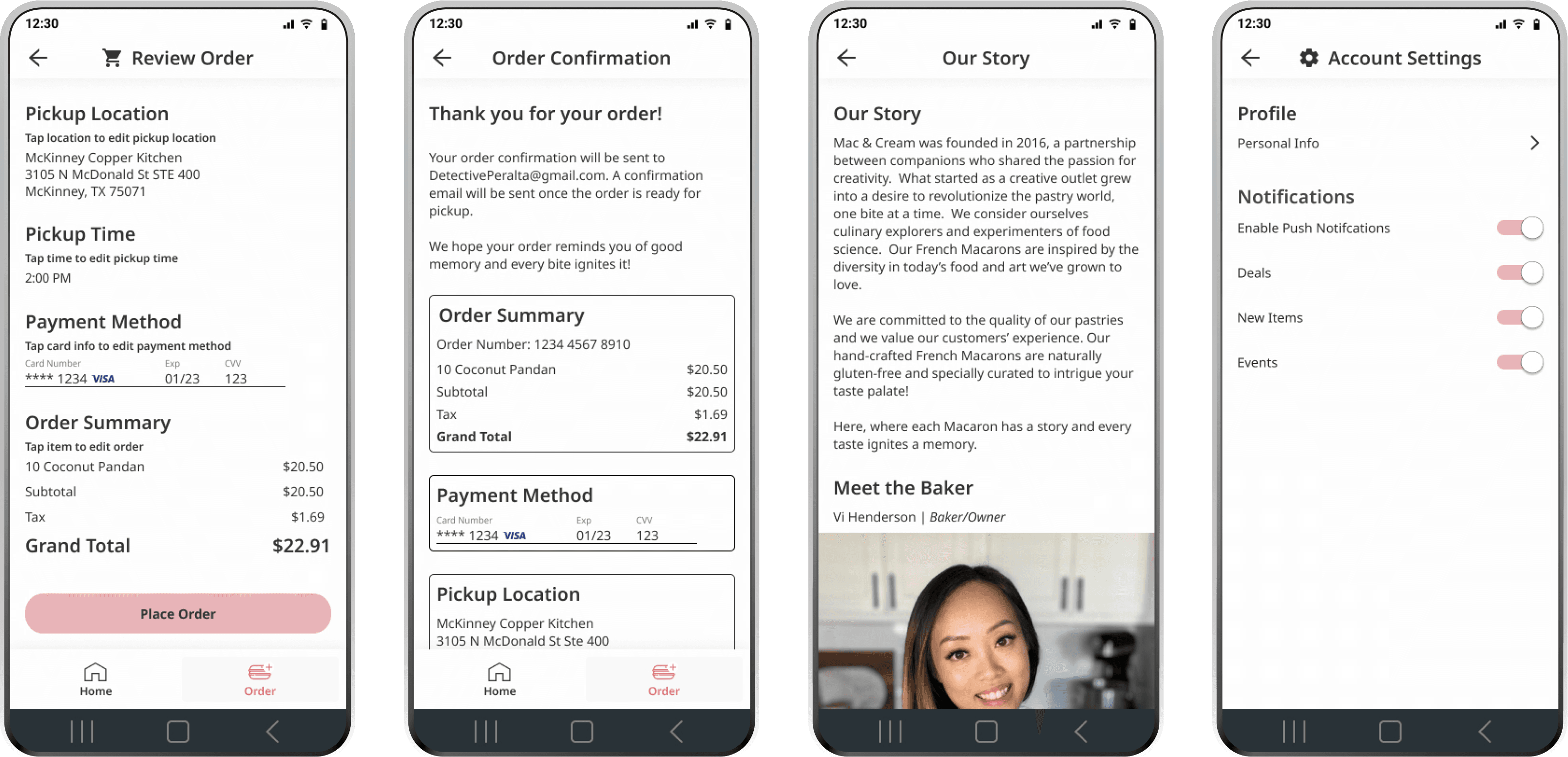
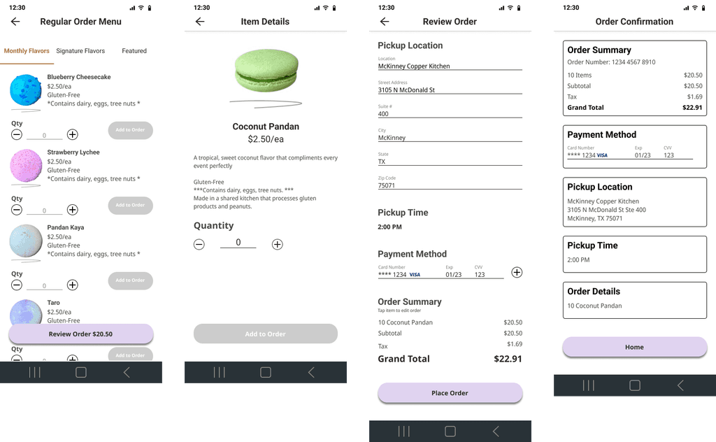
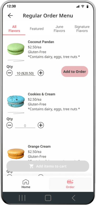
While many other apps may require the user to view the product details in order to add it, I decided to make it possible to order directly from the menu screen to save a couple of taps. This is especially useful for the busy business owner James who needs to place orders on the fly.
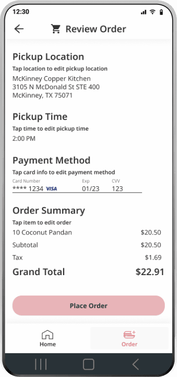
Additionally, since the user has an opportunity to make an account, it would be possible for saved details to be auto-populated like the payment methods in the review screen or personal details in the catering inquiry screen.
Order Menu Screen
Order Review Screen
Notifications, New Events, & Catering
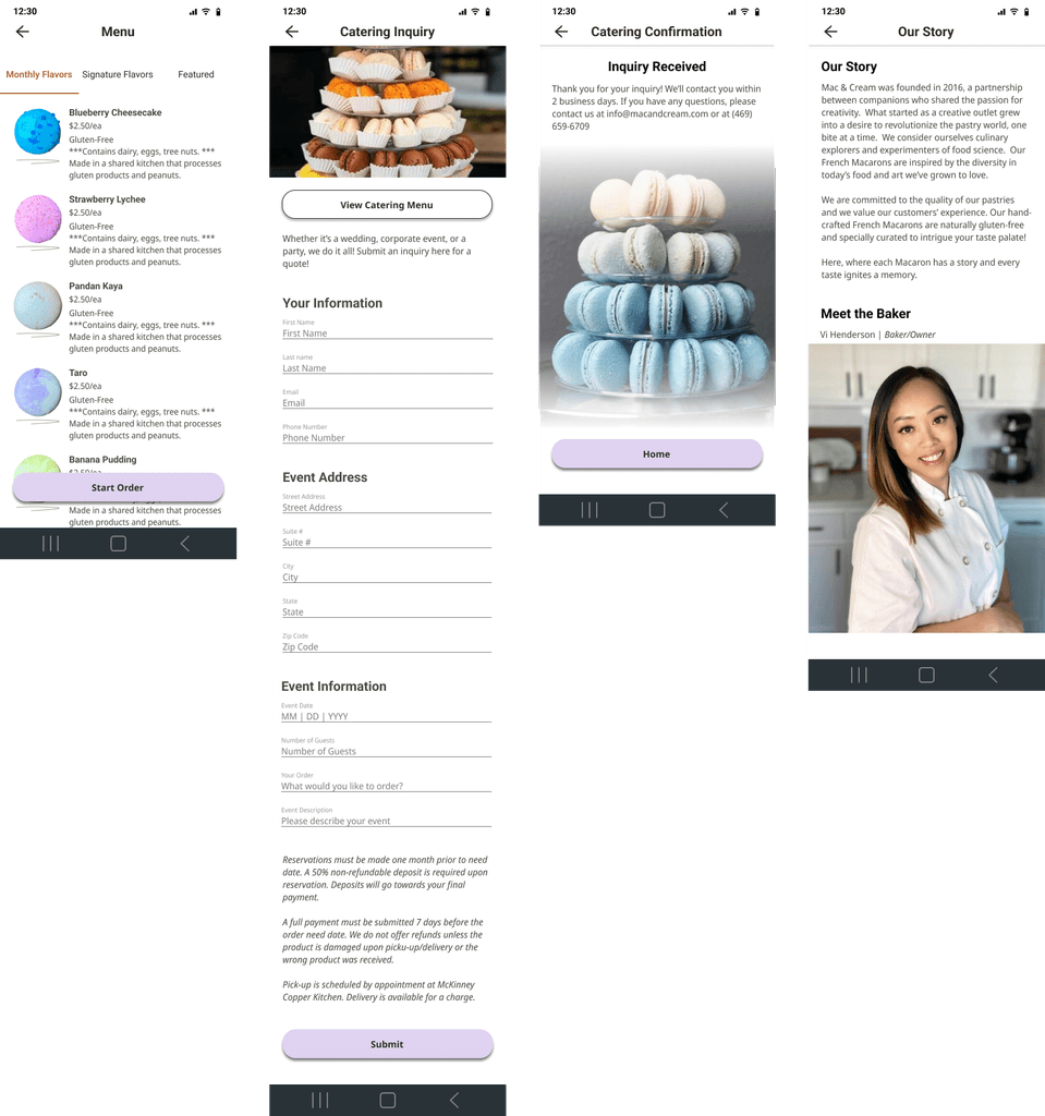
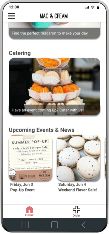
Because users had issues looking for the catering page on the website usability test, I made the catering section easily visible on the homepage. This visibility addresses the business need to produce catering leads.
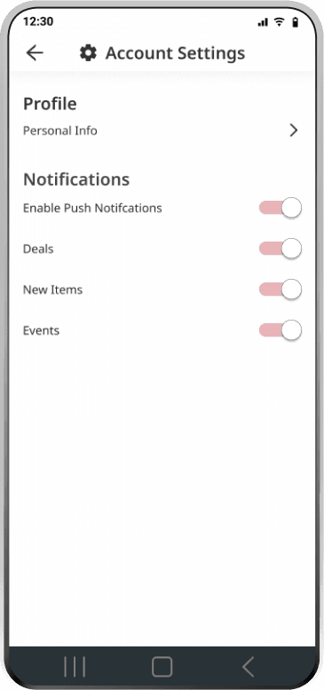
To address the user need to always have the newest items as well as the business goals for the app, I designed a screen where users can enable notifications of new items and events. Furthermore, the home page also has a section to view new updates such as upcoming events or new flavor releases.
Login Screen
Home Screen
Conclusions
Next Steps: Measuring the Success of the Design with KPI's
While the design is successful from a usability standpoint, we won't know the success of the design from a business standpoint until it becomes live. Some of the metrics we can use to measure the success of this as a live application are:


Design & Development Roadmap
💡
If there are items made specifically for one business, how would we implement their item to be ordered in the wholesale process?
💡
Especially for wholesale orders where orders are typically repeated, how can we make repeating orders easier?
💡
How can we implement additional features to this app that would encourage repeat usage?
Limitations
While one of the major user groups for Mac & Cream are wholesalers, I wasn’t able to conduct usability research or testing with them as I was not able to connect with any of them. This may have limited the insights I could have received to make better-informed design decisions.
Additionally, with limited product images, I had to adjust the UI accordingly. This had the most effect on the color schemes I was able to choose from.

